The basics of circular layouts
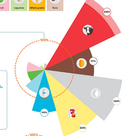
One of the most commonly used and widely recognized charts is the humble pie chart which is great for representing the proportions of various parts that make up a whole. But circular visualizations are perfectly suited to so many more situations ranging from data which captures occurrences in cyclic intervals to just displaying data more compactly.
Understanding the basics of circular layouts is also useful when conceptualising other non-rectangular layouts where data is to be repeated in tiles of triangles, hexagons, etc.
This page uses some code samples written in Javascript and some very basic mathematics.
When does a circular layout make sense?
Circular layouts are useful in three broadly categorized scenarios
Univariate data
Here there is a single variable under consideration, and the visualization shows its breakup into its constituents (pie chart, donut chart) or its magnitude (gauge charts, meters, etc).
Most of the visualizations falling under this category can easily be represented in a rectangular form, however since there is only one variable under consideration, only one axis is used for interpretation whereas the other axis is generally fixed to a particular value. This is why it makes sense to simply roll-up the rectangular form into a circular form, especially if the primary axis becomes too long.
This is the most common and recognizable usage of circular layouts and implementations of these charts are available in most charting libraries.
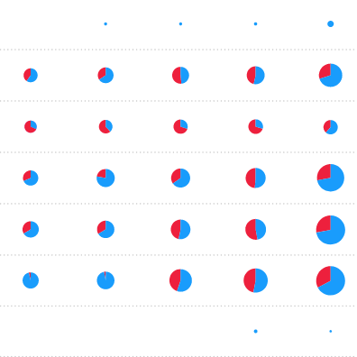
This visualization uses a number of pie charts to show spending by presidential candidates per state.
Donut charts and their variants are often used to show the breakup of winners of an election.
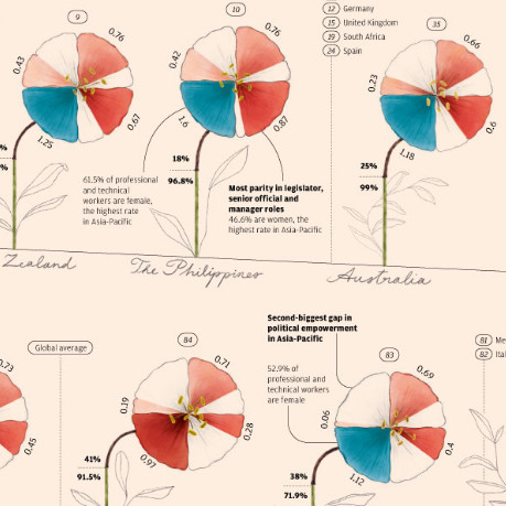
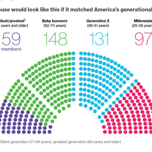
This visualization builds upon the simple pie chart to show gender inequality in the workplace.
Improving information density
The traditional rectangular layout of most types of charts can get too large along its primary axis, requiring the user to scroll way too much and make comparisons between two data points harder.
Any horizontal or vertical representation of data which is too large along its primary axis, can be potentially made to fit in a more compact form by laying out its data in a circle.
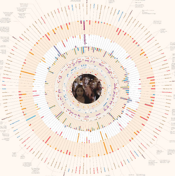
Circular layouts work very well for hierarchical structures such as trees and other multilevel charts which tend to grow as they move along one axis. This is because the upper layers with less data can be show towards the center of the circle where space is limited, while the lower layers can be shown towards the edge of the circle where the circumference is larger and provides us more space.
Some commonly used circular charts for hierarchical data are fan charts for genealogical family trees, sunburst diagrams which show multiple levels of composition and target diagrams which move from activities placed at the outer edge of the circle towards a central goal.
Other common types of charts such as line charts, bar charts, area charts, scatter plots, etc can be similarly represented in a circle by plotting one axis along the circumference of the circle instead of being a straigh horizontal or vertical line.
The D3.js library even has the d3.lineRadial method to plot circular line charts and d3.linkRadial to draw paths between nodes which have been laid out in a circular layout.
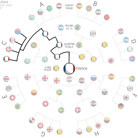
This visualization shows the FIFA match schedule as a tree with a circular layout
This visualization uses a radial line chart at its center to show spending levels of various countries.
The outer circle of this visualization is a radial histogram which is essentially a circular bar chart with the bars going outwards from the center of the circle.
Improving data representation
Cyclical patterns
Circular layouts are perfect for representing data which repeats at a set interval, for eg. weekly, monthly or even daily based on the time of day. Depending on the data, the layout used can either be concentric circles repeating at the chosen interval, or placed in a spiral.
You may want to use animation to show data from multiple cycles. For eg, if the chart displays data for one day at a time, animation or some method of manual progression, such as allowing the user to click to change dates, would be used to show data from previous or subsequent days.
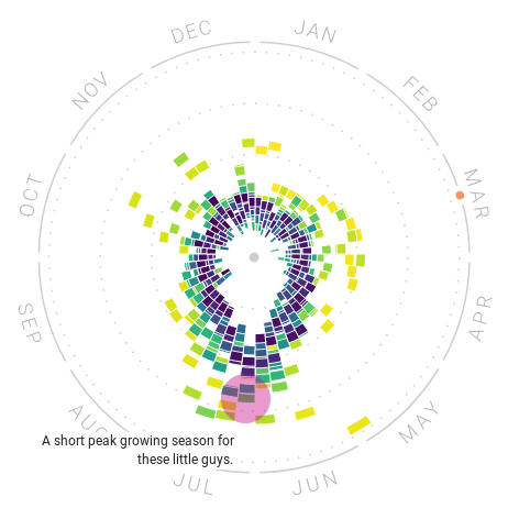
The Rhythm of Food visualization by Google News Lab and Truth & Beauty uses a circular layout to show monthly data. Colors are used to differentiate data from twelve different years while the concentric circles are used to order results based on a score.
This article has a number of visualizations using a circular layout to show the number of babies born by minute, hour, etc.
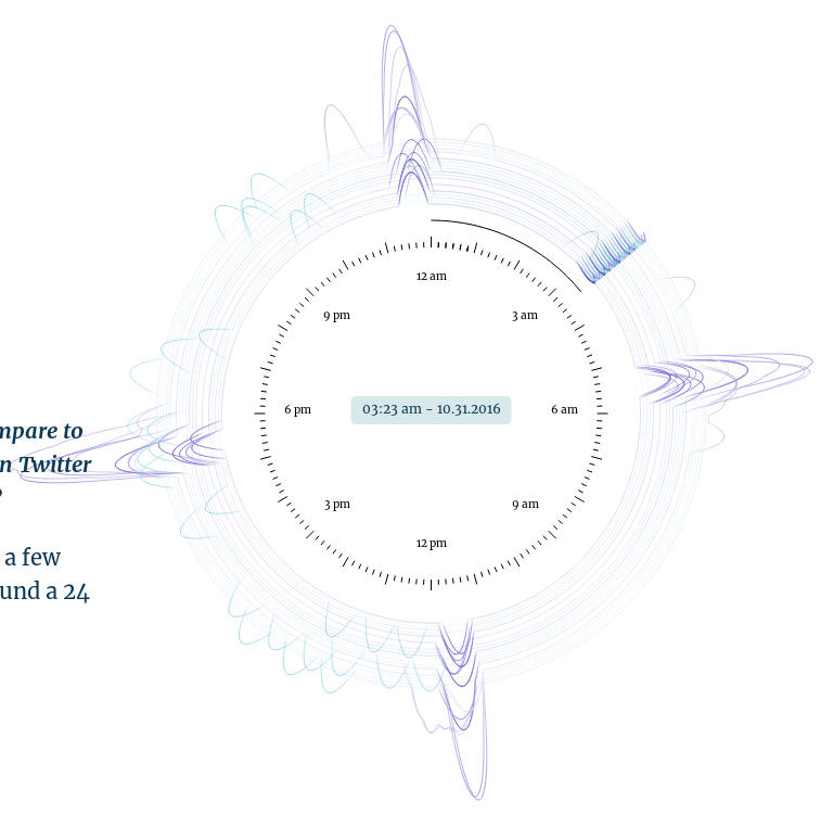
Here a circular layout similar to an analog clock face is used to show tweet frequency of various Twitter accounts, by the time of day. Concentric circles are used to represent Twitter accounts, while animation is used to show the progress of time, thus allowing multiple days data to be viewed.
Visualizing connections
Circular layouts are very commonly used to show connections between several nodes, the most common implementation of such a chart are chord diagrams which place nodes on the circumference of a circle and then use arcs to connect nodes.
Another common implementation places nodes on multiple concentric circles of different sizes and then links nodes from outer circles to inner circles. This type of chart however may get too complicated if the number of levels gets too high, a two level chart with just one inner and one outer circle works best.
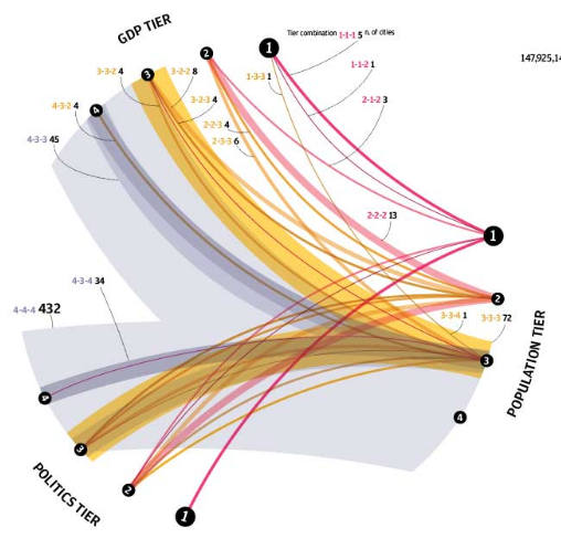
Here arcs of varying thickness are used to connect scores received by various cities on three separate metrics
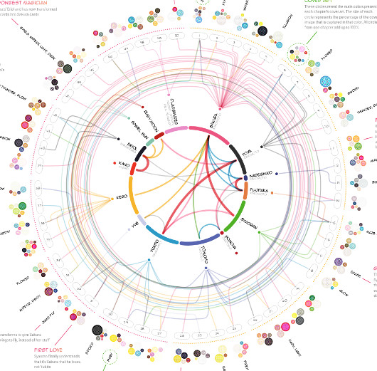
This visualization uses an inner and outer circle to show connections between characters of a manga series and chapters that they appear in.
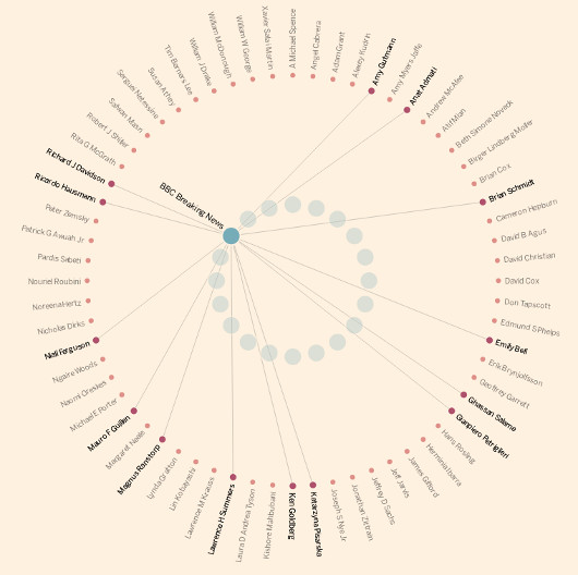
This visualization uses an inner and outer circle to show connections between Twitter accounts, and their followers selected from Davos attendees.
Basic mathematics
There are just a few basic mathematical properties needed when placing elements in a circular layout.
Transform the center of the circle
Most coordinate systems place the origin in one corner of a rectangle, for eg. SVG places the origin at the top-left corner of the SVG element.
If you were to directly start placing elements using the default origin, you would have to offset each coordinate with respect to the placement of the center of the circle. Not only is this cumbersome, it makes placing the circle at a different location more difficult, especially if you have hard-coded the center's coordinates instead of using variables.
It is therefore much more preferable to transform the container element of the circle to offset it such that the origin is at the center of the circle.
All coordinate calculations can now be with respect to the center, and even if you were to reposition the circle, all it would require would be to change the transform so that the origin correctly lies at the new center.
In SVG, this is all relatively very straight forward by placing all the circular elements within a parent <g> tag with a transform attribute which translates along the x and y axis. For eg. Consider a very simple scenario where you have a SVG based chart which is 1000px wide and 1000px tall, you could fit a circle with a radius of 500px neatly within this chart, if you placed the center of the circle at coordinates [500, 500]. This can be done by placing all elements of the circle within a group translated by 500px along each axis as shown below
<svg width="1000" height="1000">
    <g id="circleContainer" transform="translate(500,500)">
        <!-- All elements of the circular layout go here -->
    </g>
</svg>
There are 360° or 2π radians in a circle
Consider any point on the edge of a circle as your starting point and consider its angle to be 0. You can now traverse a maximum of 2π radians either clockwise or anticlockwise before you're back at the same point again.
This is extremely important to keep in mind when converting a linear axis to circular.
If you're using d3, this conversion from linear units to radians is fairly simple using the d3.scaleLinear function. For eg, if your linear axis goes from 53 to 5000, simply create a new linear scale in d3 as
var circularScale = d3.scaleLinear().domain([53, 5000]).range([0, 2*Math.PI]);
You can calculate a point's coordinates once you know its angle and distance from center
Once you have determined that you wish to place an element at an angle of θ radians and distance r from the center of the circle. We can easily use the sin and cos functions to get precise x and y coordinates.
// Returns coordinates as [x, y]
function getCoordinates(radians, distance) {
    return [Math.cos(radians)*distance, Math.sin(radians)*distance];
}
Here are some more visualizations which use circular layouts in innovative ways
That's it, if you know of any tips or have come across a beautiful visualization which uses a circular layout, do comment below and let us know.